

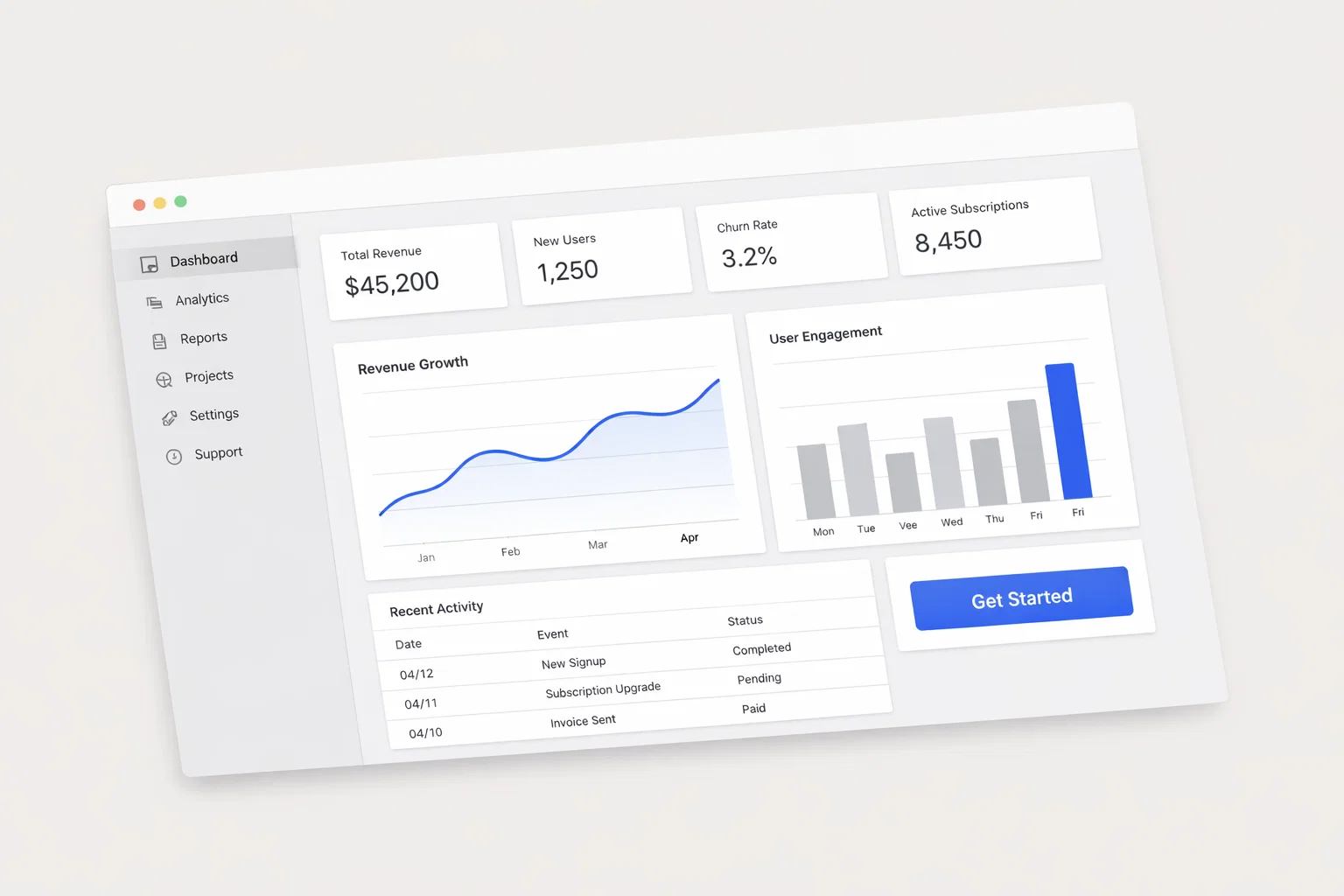
A high-converting website for promoting an application is not a visual exercise first. It is a UX and conversion architecture system that helps the right user understand the product fast, trust it enough to act, and move through the lowest-friction path to install, start a trial, book a demo, or create an account.
For this niche, the best model is SaaS-style design with app-marketing discipline: clear value proposition on the homepage, strong feature and use-case pages, persuasive pricing or plan logic, and an onboarding-oriented funnel. Credibility comes from intentional layout choices, transparent rationale, accessible interaction patterns, technical performance, and ongoing testing rather than aesthetics alone.
What makes an application website convert
Application-promotion websites usually win or lose in the first screen. Above-the-fold clarity matters because users make an early judgment quickly, and current guidance still treats the first five seconds and the visible hero area as the highest-value decision space on the page.
This niche typically converts through a small set of primary goals: app installs, free trials, demo requests, account creation, and qualified leads. Cross-industry landing page benchmarks vary, but recent roundups place the median around 6.6%, while SaaS pages are materially lower at about 3.8%, which is a useful reality check for application websites competing in a more skeptical category.
Current web behavior also raises the trust threshold. Personalized above-the-fold content and message matching are becoming more common because visitors expect relevance quickly, especially when they arrive from ads, search, or partner campaigns.
Key takeaways:
- Lead with one primary outcome per page.
- Make the product understandable in under one screen.
- Support claims with proof, not adjectives.
- Reduce friction between interest and first product experience.
- Treat mobile, speed, and accessibility as conversion systems, not technical clean-up.
| Design Element | Priority Level | Conversion Impact |
| Clear hero value proposition | Critical | Defines whether users continue or bounce. |
| Single primary CTA | Critical | Reduces choice overload and keeps momentum focused; Unbounce summary data reports 13.5% conversion for single-CTA pages versus 10.5% for pages with five or more links. |
| Trust signal architecture | High | Lowers skepticism during signup or demo consideration. |
| Product proof (screens, use cases, outcomes) | High | Turns abstract software into a believable solution. |
| Page speed and interaction quality | High | Only about 40% of mobile origins pass all three Core Web Vitals in one 2025 large-scale analysis, so performance is still a real competitive gap. |
| Accessible forms and navigation | High | Expands usable audience and reduces legal and UX risk. |
| Post-launch testing | High | Heatmaps and session recordings reveal friction that standard analytics misses. |
User behavior and site structure
Users visiting an application website usually move through four stages: orientation, evaluation, proof-checking, and action. They want to know what the app does, whether it is relevant to their job or problem, whether it is safe and credible, and what the first commitment will cost in time, money, or risk.
Behavior differs sharply by intent level. High-intent visitors often arrive from brand search, comparison search, referrals, or retargeting; low-intent visitors often arrive cold from broad ads, social content, or top-of-funnel search. Your layout should assume both are present and route them differently.
Behavioral characteristics:
- High-intent users scan for pricing, integrations, setup time, and proof.
- Low-intent users need category context and pain-solution framing.
- Returning users look for reassurance, not re-education.
- Mobile users prefer shorter paths, larger targets, and less form effort.
- Enterprise or B2B evaluators often need stakeholder-proof content such as compliance, case studies, and team credibility.
| Visitor Type | Typical Behavior | Main Friction Point | Best UX Response |
| High-intent | Jumps to pricing, features, or demo CTA | Hidden details or weak proof | Expose pricing, proof, FAQs, and product fit fast. |
| Low-intent | Reads hero, benefit blocks, and social proof | Confusion about relevance | Use sharp headline, use-case segmentation, and a guided CTA. |
| Returning | Scrolls less, compares more | Unresolved objection from prior visit | Surface reviews, case studies, security, and objection-handling blocks. |
| Mobile | Skims, taps, abandons quickly on friction | Small controls, slow load, long forms | Thumb-zone CTAs, compressed media, autofill, and concise sections. |
For information architecture, keep the site shallow and role-based. Most app-promotion sites should let a visitor reach any critical answer in one or two taps from the homepage.
Recommended structure:
- Homepage.
- Features or product overview.
- Use cases or solutions by audience segment.
- Pricing or plans.
- Proof layer: testimonials, case studies, ratings, logos.
- Security, privacy, and compliance.
- About/team/contact.
- Help center or onboarding preview.
- Dedicated landing pages for campaigns and app-store traffic.
| Navigation Model | Best Use | Risk |
| Flat navigation | Most application websites | Better discoverability, lower cognitive load. |
| Deep navigation | Large product suites only | Hides value and increases abandonment for first-time visitors. |
Above the fold, prioritize headline, subheadline, one primary CTA, one secondary reassurance, and a product visual. Because first-screen clarity remains decisive, do not waste hero space on generic branding language.
Homepage and funnel architecture
Your homepage should behave like a guided first meeting. It should orient, qualify, prove, and route.
Homepage must-have elements:
- A plain-language headline naming the problem and outcome.
- A subheadline explaining who the app is for.
- One primary CTA, such as Start free, Install now, or Book a demo.
- A product visual that shows interface, not abstract art.
- Trust signals near the hero: client logos, ratings, user count, security note.
- A use-case section by audience or role.
- A proof section with testimonials, case studies, or quantified outcomes.
- A low-friction FAQ block.
- A footer with legal, privacy, contact, and support paths.
| Section | Purpose | Conversion Role |
| Hero | Explain value instantly | Prevents bounce, drives first click |
| Social proof band | Establish legitimacy | Lowers skepticism early |
| Feature-benefit block | Translate capabilities into outcomes | Builds relevance |
| Use-case segmentation | Self-identification | Improves message match |
| Proof section | Validate claims | Supports consideration |
| Pricing or CTA band | Ask for action | Moves visitor into funnel |
| FAQ | Remove objections | Recovers hesitant users |
CTA architecture should match funnel stage. Cold traffic needs lower-commitment actions such as Watch demo, See how it works, or Explore features. Warm traffic can handle stronger asks like Start free trial or Create account. Enterprise traffic may need Talk to sales or Book a live demo.
| CTA Type | Placement | Recommended Copy Style | Expected Impact |
| Primary acquisition CTA | Hero, sticky mobile bar, end of major sections | Action-led, specific | Highest click-through on warm traffic |
| Secondary education CTA | Hero or product explainer blocks | Learn/Watch/Explore wording | Captures lower-intent visitors |
| Proof CTA | Case studies, testimonials, comparison pages | See results / Read story | Helps mid-funnel evaluation |
| Recovery CTA | Exit-intent, pricing FAQs, support blocks | Talk to us / Ask a question | Saves hesitant visitors |
Recent landing-page benchmark roundups continue to support fewer choices and tighter focus. One 2026 summary of Unbounce data reports better conversion on pages with a single CTA than on pages loaded with multiple links.
Form design should remove avoidable work. Current landing-page guidance also reinforces that shorter forms, smart defaults, autofill, progressive profiling, and larger mobile-friendly fields reduce friction.
Form optimization steps:
- Ask only for what the next step truly requires.
- Split “signup” from “qualification”; do not overload first contact.
- Use progressive profiling for returning leads.
- Enable passwordless or social sign-in where appropriate.
- Keep labels persistent and error messages inline.
- On mobile, use the right keyboard type for each field.
- Show privacy reassurance directly near submit.
AI personalization now matters, but only when it supports clarity. Good use cases include swapping headlines by traffic source, changing CTA text by intent, surfacing relevant use cases by industry, and adapting proof blocks for returning visitors.invespcro+1
Trust, mobile, performance, SEO, and accessibility
Application websites face elevated skepticism because users are being asked to trust software with time, data, workflow, or money. Trust therefore cannot live on one testimonial strip; it has to be distributed across the journey.
| Trust Signal | Placement | Credibility Impact |
| User/customer logos | Near hero and proof sections | Fast social validation |
| Ratings and reviews | Hero support, pricing, case studies | Reduces uncertainty |
| Case studies | Mid-page, solution pages, resource hub | Supports decision with evidence |
| Security/privacy statements | Footer, forms, pricing, signup | Eases data-risk concerns |
| Team and founder visibility | About page, contact, investor/company page | Humanizes the product |
| Certifications/compliance | Security page, enterprise CTA areas | Important for regulated buyers |
Implementation notes:
- Put at least one trust cue above the fold.
- Pair claims with evidence, such as numbers, logos, or screenshots.
- Show human accountability through team, support, and contact paths.
- Make privacy, terms, and data handling easy to find.
For mobile, design from the thumb zone outward. The primary CTA should be reachable, visible, and repeated at natural scroll breaks; long floating menus, tiny tap targets, and multi-column comparisons usually underperform on small screens.
Mobile checklist:
- Use sticky or repeated CTA placement.
- Keep section length short and scannable.
- Compress screenshots and videos.
- Avoid modal overload.
- Use autofill, numeric keyboards, and large tap targets.
- Reserve space for app-store buttons if install is a primary goal.
| Desktop Priority | Mobile Priority |
| Rich comparison depth | Fast orientation and simple action |
| Larger proof panels | Compact trust snippets |
| Feature exploration | One-thumb CTA access |
| Multi-column layouts | Single-column reading flow |
| Hover interactions | Explicit tap states |
Performance is a conversion variable. Google’s Core Web Vitals framework centers on LCP, INP, and CLS, and Search Console evaluates pages using real-world field data rather than lab-only simulation.
A practical benchmark set for application websites is: LCP under 2.5 seconds, INP under 200 milliseconds, and CLS under 0.1. Large-scale 2025 studies show many sites still fail these marks, especially on mobile and on INP, which makes performance a real differentiator.increv+2
| Performance Metric | Target Benchmark | Conversion Impact |
| LCP | < 2.5s | Faster perceived load, lower abandonment |
| INP | < 200ms | Better responsiveness during taps and typing |
| CLS | < 0.1 | More stable UI, less accidental interaction |
| Third-party scripts | Minimize and defer | Reduces responsiveness issues |
| Media payload | Compress and lazy-load | Helps mobile completion |
Quick-win optimizations:
- Replace autoplay hero video with poster image plus play trigger.
- Preload key fonts and hero assets.
- Audit third-party tags quarterly.
- Lazy-load below-the-fold media.
- Reserve image and embed dimensions to prevent layout shift.
SEO should support conversion, not fight it. Build pages around user intent clusters: what the app does, who it is for, why it is better, how much it costs, how secure it is, and how quickly a new user can succeed.
SEO-UX alignment checklist:
- One search-intent target per landing page.
- Clear H1 and scannable H2 hierarchy.
- Internal links from homepage to high-intent pages.
- Use-case pages for segment traffic.
- Structured FAQs for objection handling.
- Schema where relevant: organization, software application, FAQ, review.
Accessibility is now part of baseline product quality. WCAG 2.2 is the current W3C standard, organized around four principles—perceivable, operable, understandable, and robust—and it adds nine success criteria to WCAG 2.1.
Optimization, mistakes, comparison, roadmap, appendix, and FAQs
Post-launch, use analytics to find where users hesitate, then use behavior tools to explain why. Heatmaps show aggregate click and scroll behavior, while session recordings reveal the individual journeys and abandonment moments behind those patterns.
CRO testing process:
- Define the page KPI by intent stage.
- Find the biggest drop-off point.
- Inspect heatmaps and recordings.
- Form a single hypothesis.
- Test one dominant variable at a time.
- Roll out winners and retest quarterly.
Common mistakes that kill conversions:
- Generic headlines that never name the problem.
- Too many primary CTAs on one page.
- Hiding pricing, setup expectations, or security detail.
- Using decorative hero art instead of product interface.
- Overbuilt navigation with too many top-level choices.
- Mobile pages that are visually polished but thumb-hostile.
- Long forms before trust is established.
- Heavy JavaScript, chat widgets, and trackers that slow interaction.
- No proof for claims such as “easy,” “powerful,” or “trusted.”
| Niche | Main Conversion Trigger | Trust Standard | Pattern Worth Borrowing |
| Application promotion | Clarity + low-friction first action | Product proof, security, onboarding confidence | SaaS pricing logic, app-store cues |
| Service business | Human trust + expertise | Team, certifications, reviews | Strong contact and consult paths |
| E-commerce | Product confidence + checkout ease | Reviews, shipping, returns | Rich social proof and urgency handling |
Transferable insights:
- From SaaS: strong feature hierarchy and trial/demo architecture.
- From e-commerce: sharper proof placement and mobile-first CTA repetition.
- From service businesses: better team visibility and trust storytelling.
Implementation roadmap:
- Define one primary conversion and two secondary micro-conversions.
- Map audience segments by intent: cold, warm, returning, enterprise.
- Audit current pages for clarity, friction, proof, speed, and accessibility.
- Build a shallow sitemap around user questions, not internal teams.
- Wireframe homepage, pricing, feature, and use-case pages before visual design.
- Prototype mobile-first CTA paths and forms.
- Develop with performance budgets and accessibility checks built in.
- QA on real devices and real task flows.
- Launch with baseline analytics, recordings, and CWV monitoring.
- Run a 90-day test plan focused on hero, CTA, proof, pricing, and form friction.
FAQ:
- Should an application website focus on installs or education first?
If the traffic is cold, educate first and ask for a lighter action; if the traffic is branded or retargeted, move faster to trial or install. - How many CTAs should the homepage have?
One primary CTA, plus one lower-friction secondary CTA if needed; too many choices dilute momentum, and recent benchmark summaries still favor a single-CTA page model. - Is pricing always necessary?
For self-serve products, yes in most cases. Hidden pricing slows trust and creates qualification friction. - What matters more: visuals or speed?
Both matter, but performance is part of the UX itself, and many sites still miss acceptable Core Web Vitals thresholds on mobile. - How important is accessibility for app-promotion sites?
Very important. WCAG 2.2 is the current W3C standard and should be treated as a baseline quality and risk-control requirement. - Should I personalize the homepage?
Yes, when personalization clarifies relevance by traffic source, segment, or return state rather than adding complexity. Personalized above-the-fold content is becoming a stronger conversion pattern in current guidance. - What should I test first after launch?
Start with hero message, CTA copy, proof placement, pricing explanation, and first-step form friction.
What is the most common app-site failure?
A homepage that looks modern but never explains the product, the audience, or the next step with enough confidence.